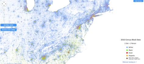
The Weldon Cooper Center for Public Service, at Virginia University, has published a map showing the results of the 2010 US Census at the census block level. For each person in the country there is a dot: blue for Caucasians, green for people of African ancestry, red for Asians, orange for Hispanics, and brown for others. As your screen has no resolution enough to see the distinct dots, you will see hues that reflect the mixed color according to the proportion. So you can see population density as well as the geography of segregation.
Quite an interesting trip to enter this map. In some countries in which race data is not used for census (according to a legally established will to avoid discrimination), as in France, such a map can not be drawn (as the data does not exist in a systematic way), despite the fact that it could be of some use. This does not mean you have no data on poverty, but rather that you are portraying effects, not what you think may be the cause.


Leave a comment