Maps

Blocks (5)- Maps 2015 (16) Barcelona as seen by the tax man

pbarna 0-0

French geographer Yves Lacoste used to say that geography is since its inception a war tool. It’s not my aim to contradict him, but in fact urban cartography is since its inception a tool to levy taxes… here are the primary results of processing the cadastral maps of Barcelona by assigning a 3 m height to each level above ground… More soon.

vinbarna2-b

vinbarna2-a

Maps 2015 (12) Seeing TV in Italy

grande fratello

Design Density is a research laboratory at the Design Department of the Milano Polytechnic. The Link Magazine, published by Mediaset, called them to do a work for their tenth issue in which they were to visualize a series of datasets concerning how Italians see TV. From the first season of Big Brother and its followers by region (quite related to the places contenders came from) to other issues as the time “compass roses” of audience by chain. All this can be seen in a Flickr group.

Maps 2015 (11) Views of the world in the 1940s

Richard Edes Harrison’s story is interesting: how a designer became a cartographer not because of specific map-making skills, but rather through his ability to convey a complex information to common people. In a moment (WWII) in which aviation was the technology that transformed the perception of distances, his maps introduced to the US public projections and perspectives that, by going ahead of the traditional Mercator projection, allowed people to better understand the events as they unfolded.

Timothy Barney’s and Kenneth Field’s articles are interesting

Maps 2015 (9) Fracking in the North Dakota Oil Boom

mapas 2015-9- Fracking dakota

Here is a map by Mason Inman that is far from clear at first sight, but which is appealing from an aesthetic point of view. When you zoom in things become clearer: extracting oil can happen through horizontal pipes, so these are the most visible elements in the map. Each well has data associated. The way the land is exploited is surprising, it almost seems an agrarian structure.

Maps 2014 (41) Churyumov-Gerasimenko in Paris

I usually fancy maps that tell stories in which you can feel the scale of things. And this week’s news (with the ode to joy as a background sound and the twelve star banner) is somehow related. Beyond the million km distance, what surprises is the small size of the comet (you could walk all along it in just an hour, provided walking is feasible without gravity…) when related to a big city. The image has been published by the European Space Agency and conveys the idea of the ability of mankind to transform the surface of this planet on a geological scale, even on an interplanetary one (if we can see the comet from here well enough to reach it, chances are Paris can be seen from there…)

Maps 2014 (17) Hotspots of land use change in Europe, 1990-2006

ESPON is the European Observation Network for Territorial Development and Cohesion, adopted by the European Commission as a programme in 2007. It has just published a map of the “hotspots” of land use change on a continental scale.

The map is built around the concept of use intensity. Regions with light of white colours have had smaller changes; blue ones have intensified land use (grasslands become urban areas, or more intensive agriculture zones), while the green ones have been subject to intensification (going from more to less intensive agricultural use). According to the map notes the data series are not homogeneous and some countries have no data, but you can see how intensification through tourist second homes has played a role in Mediterranean Spain, and how eastern Europe is intensifying, for instance in how Prague is “vacuum cleaning” peripheral Czech regions.

Maps 2014 (5) Sara Graham

maps5-sara graham

Sara Graham is a Canadian artist working on maps as art objects. Her maps of Canadian cities, re-assambled as a collage of road symbologies, are an interesting part of a work in which architecture is also relevant. And some works, as the maps of Prince Edward Island, get close to some Guy Debord proposals to rectify the Seine at Paris

maps5-sara graham.autop

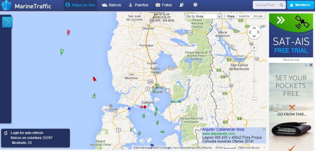
Maps 2014 (2) marinetraffic

 We usually think that maps can portray what has existed in a past moment or what could come into existence in a future. Up until now it was far less common to have dynamic maps of what was happening. This is precisely what marinetraffic.com does, exploiting data from the Automatic Identification Systems that are compulsory for any ship over 330 tons (this is the reason why most smaller ships do not appear).